


I absolutely Hate this intersitual.
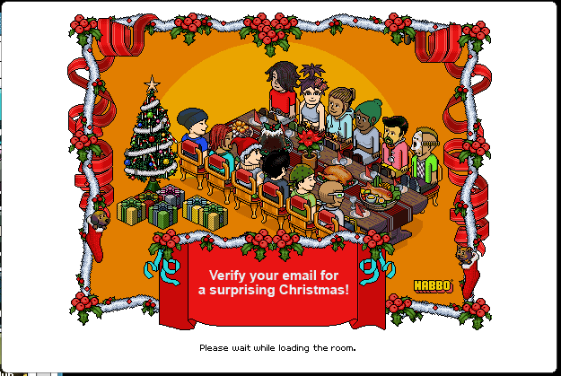
I mean it looks so tacky!, the Habbo logo is wrong colour, the blue ribbons are EW. and the text is Non-Habbo like..
Just a bit Disgusting tbh..
Only good thing is the new wooden table
Results 1 to 10 of 27
Thread: Worst Intrsitual Ever!
-
 Worst Intrsitual Ever!
-
27-11-2009, 04:50 PM #2

It's not that bad? :s
-
27-11-2009, 05:06 PM #3

- Join Date
- Feb 2006
- Posts
- 24,818
- Tokens
- 64,172
- Habbo
- FlyingJesus
-
27-11-2009, 05:06 PM #4

Ewwww why are those blue ribbons so mingy :L
-
Can't say I care what interstitials look like..
 Quite looking forward to the surprises though.
-
I suppose you're right. The logo isn't the wrong colour though?

-
27-11-2009, 07:10 PM #7
OH MY GOD.
-
Its not too bad but they could have done a massively better job

-
What a bloody outrage.
First theyban you and now they have most upset you by making a banner that does not reach the standards of the king of pixel art himself.
LIVING OUTRAGE.
No.
-
Actually.... when I saw that I was thinking of how nice it looked
Come on, it's Christmas - Christmas wouldn't be Christmas without a bit of tack!


 Reply With Quote


")


 Posting Permissions
- You may not post new threads
- You may not post replies
- You may not post attachments
- You may not edit your posts