

Ok some people might remember me from 4-6 monthes ago (the graphics section)
I sycked at alts and i always got critasized but no one ever seemed to give me any tips or
tricks on how to improve the alt that you say your self ''sucks''
i have started some new stuff 2 days ago and i want to show you lot if you like them
and if not, please give me any tips on how i can improve and tell me where i have gone wrong so i can fix it and learn to get more better at alts with your help.
Hope you liked them
and like ive said, if any errors please tell me and if not to much bother explain how i can improve.
Results 1 to 10 of 11
Thread: [Dx] Brand New stuff
-
 [Dx] Brand New stuff
Im A Graphics noob [
[Dx] Brand New stuff
Im A Graphics noob [ ] And Im Proud Of IT
-
20-04-2010, 07:14 PM #2

First one looks a little messy with all the colors, but they look good.
-
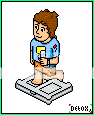
On the running 1 the right leg looks a bit weird, but there okay
 God said, let there be light.
-
he is acctualy doing step ups on the wii fit board, thats why his right leg is right behind the board but i couldnt work out how i could make it close to there without making it clash.
 Originally Posted by marine
 Im A Graphics noob [] And Im Proud Of IT
-
it looks as if the board is on a layer higher than the person himself so the perspectives a bit messed there. Originally Posted by Detox,
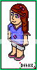
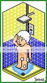
these alts have potential, if the colours were picked wiser. e.g. the colours for the shower aren't a great choice, they are too bright and there's no definition in the colours in a few of them, it looks as if you have used paint's original palette, try some new colours. some good concepts.
drink up this bottle of yeah
and P A I N T your body on me
-
an alt i forgot to put on
 Im A Graphics noob [] And Im Proud Of IT
-
I like the habbo in the shower
very funny =)
-
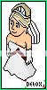
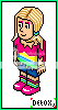
They're really good. The first two you should rotate horizontally, put on a template and enter into the runway comp :-) The first one's my favourite and I love the cute face you've done on it (although you might wanna replace it with the habbo face for comp). The detail on that outfit is great and I love your use of colour.
The second one could perhaps do with a little more shading on the length of the hair as a suggestion? I'd use the base colour but maybe a couple of shades darker to show where the movement is in the hair (black can be a little too harsh and noticeable, you want the colours to blend when shading). I like the little knees you've put on her, it's a nice extra touch.
The third one is good, but his left knee should be above the scale, at the moment it looks as if it's going into it.
The fourth one is great I love it, and I can't think of anything really wrong with it. It made me laugh, great idea! His six-pack's ace
The fifth one has great hair, although the tiara could do with the lines altering a little to be a bit more isometric, and shading. And I'd perhaps alter the red detail on the dress so that it was a little less jagged.
Keep up the good work!Last edited by JoeyJo; 21-04-2010 at 11:29 AM.
-
Originally Posted by JoeyJo
thankyou for your great feed back it really does make a differance
i will start new projects today.Im A Graphics noob [] And Im Proud Of IT
-
Your welcome, I'm looking forward to seeing what you come up with next! Are you going to enter runway?

 Reply With Quote


 Posting Permissions
- You may not post new threads
- You may not post replies
- You may not post attachments
- You may not edit your posts