

Habbo Banner
Hello, Im HabboGraphics i make banner such as this, Im willing to make banners like this for people Just Message Me Thank You
Results 1 to 10 of 14
Thread: Rate My Banners
-
 Rate My Banners
-
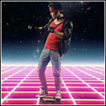
The text looks nice with the ballons and all but the people are just out of place
 Maybe put them down at the bottom of the banner so it looks like there standing up and a white stroke maybe (Well the boom box dude)
9/10
-
Thanks Mate, I'll Make A New Onee And Get pictures from habbo itself
-
Ok
 Originally Posted by HabboGraphics

 Im looking forward to see it
-
Hey How did you do that Banner underneath your text ?
-
-
Yes Yes
-
Well i made it , its in 4 parts though
PM me if you would like one made , what bg color and your avatar and pics you want on them
*Staying on topic before a mod warns us *
-
Improvements:
- The lines which travel long the left and bottom edges could be removed or continued along the other edges.
- The tops on some of the letters (the "b"s and the "p") are thinner than the rest of the score, they need to be corrected.
- As I said in your other thread, the flower doesn't look like it belongs there.
- As Nick said, you could add a stroke around the habbos to make them seem less out of place.
Nice work though, keep it up!Last edited by RandomManJay; 28-02-2011 at 08:26 PM.

-
28-02-2011, 09:23 PM #10
The free text gen you used for the text is too spaced out, Made them conjoined, Take a look at the HXL banner for example
6/10


 Reply With Quote


 Posting Permissions
- You may not post new threads
- You may not post replies
- You may not post attachments
- You may not edit your posts