

Rate, Hate, Appreciate. Back from a long long time ago.
Results 1 to 10 of 11
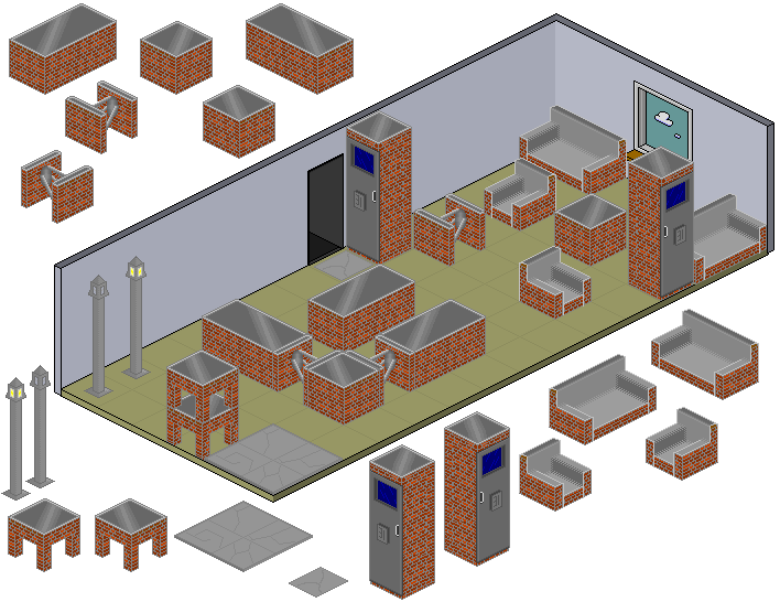
Thread: Urban Collection - Old Alt.
-
04-04-2011, 11:01 PM #1
- Join Date
- Jul 2006
- Location
- Manchester
- Posts
- 250
- Tokens
- 0
- Habbo
- ..::FREWIN::..
 Urban Collection - Old Alt.

Cannot believe you made me cut 10px from the bottom of my sig.
-
05-04-2011, 02:24 PM #2

The only thing I don't like is you not using a black outline, but they look cool nevertheless.

-
not sure about the grey outline. or the grey on the furniture. it doesnt match :S
-
05-04-2011, 06:18 PM #4
Loving the tele or what ever it is!

-
05-04-2011, 06:22 PM #5

Don't really like the huge amount of grey. :L Try adding some more colour.
Former General Manager
Former Forum Manager
Former Site Manager
I've left, but I still visit sometimes!
-
I really like them and think they look vibrant and professional.
Good job.Jordan
-
05-04-2011, 07:33 PM #7
I don't really like it. The are good alt's but (my own opinion) they don't appeal to me.

-
Black outline would make these look soooo much better, great though
-
06-04-2011, 06:01 AM #9

- Join Date
- Jan 2009
- Location
- Oxford
- Posts
- 3,191
- Tokens
- 607
- Habbo
- orientalframe?
Overall there actually really good, I would definately suggest using a black outline as stated somewhere above, It would look fantastic. Other than that, truly brilliant.
-
06-04-2011, 11:21 PM #10
- Join Date
- Jul 2006
- Location
- Manchester
- Posts
- 250
- Tokens
- 0
- Habbo
- ..::FREWIN::..
I'll edit them, and add a black outline
Cannot believe you made me cut 10px from the bottom of my sig.

 Reply With Quote


 - Click


")


 Posting Permissions
- You may not post new threads
- You may not post replies
- You may not post attachments
- You may not edit your posts